South America ↗
Total surface area17,840,000 km²editorial estimate
Population437,788,2412025
Population density24.5 per km²editorial estimate
TypeContinent
Africa is larger: 30,370,000 km² (editorial estimate) versus 17,840,000 km² (editorial estimate) for South America, or about 70% more.
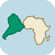
Both areas at the same scale: South America and Africa. Drag the outlines, separate them and see what the Mercator map hides.
Drag the outlines to overlap them, or place them side by side.
True area tells a different story than the Mercator map.
South America equals about 59% of the area of Africa, a gap of about 12,530,000 km².
Africa has 3.5× the population of South America. Africa is 2.1× as dense.
Area multiplier at each center: 1.06× (South America, 14°) and 1.01× (Africa, 6°).
The Mercator projection enlarges areas more and more the farther they lie from the equator. The centers of the two areas lie about 14° (South America) and 6° (Africa) from the equator. An estimate based on each center’s latitude gives an area ratio of 1.6 : 1, compared with the real ratio of 1.7 : 1. This is not a measurement of the entire outlines on a Mercator map.
Tip: You can also compare these items dynamically by clicking the link below and dragging them directly across the global interactive map.
At least one value represents a continent: its area is an editorial estimate of the whole landmass, and its population is the sum of the 2025 World Bank figures of its countries (all of Russia counted in Europe). Treat the result as an approximation. The overlay uses an equal-area projection. Coastal outlines are simplified and do not include all waters counted in the statistics. Their area ratio can therefore differ from the ratio of official total areas. Geometry: Natural Earth, public domain. Read the methodology ↗
The Mercator projection preserves angles, but it stretches surface area more and more with distance from the equator. The center of the outline for South America lies about 14° from the equator (where the local Mercator area scale reaches about 1.06×), compared with about 6° for Africa (about 1.01×). That latitude difference shifts the apparent size ratio on a Mercator map to about 1.6 : 1, compared with the true area ratio of 1.7 : 1.
By surface area alone, Africa (30,370,000 km² (editorial estimate)) could hold South America (17,840,000 km² (editorial estimate)) about 1.7 times over. The smaller territory represents about 59% of the larger one, with an area difference of about 12,530,000 km².
Africa has the larger population: 1,546,877,498 residents compared with 437,788,241 in South America (a ratio of about 3.5 : 1). Population density measured over land area is higher in Africa at 50.9 people per km², compared with 24.5 per km² in South America (about 2.1 times as dense).