
How big were history's empires? See them at true scale
Pick an empire to see its extent, its figures and comparisons with today's countries. On Mercator, regions far from the equator grow; on Equal Earth, their true proportions come back.
Choose an empire
Each thumbnail shows an empire at its largest on the Equal Earth map. They all share one scale, so you can compare them.
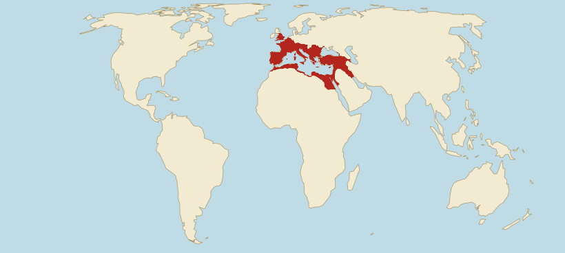 Roman EmpireLargest extent in AD 117: 5.3 million km². Figures, comparisons with today's countries and a timeline.
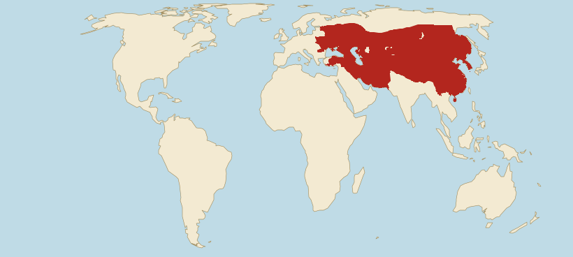 Mongol EmpireLargest extent in 1279: 27.4 million km². Figures, comparisons with today's countries and a timeline.
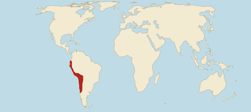 Inca EmpireLargest extent in 1532: 2.03 million km². Figures, comparisons with today's countries and a timeline.
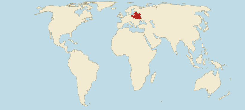 PolandLargest extent in 1619: 940,000 km². Figures, comparisons with today's countries and a timeline.
All the empires on one map
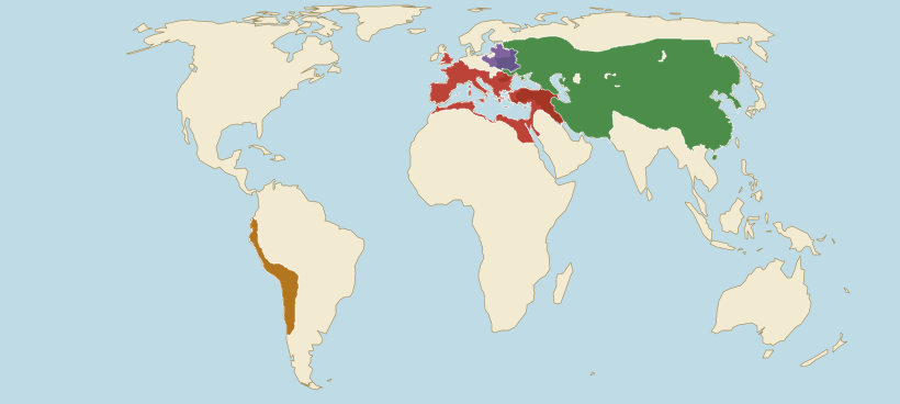
- Roman Empire AD 117, 5.3 million km²
- Mongol Empire 1279, 27.4 million km²
- Inca Empire 1532, 2.03 million km²
- Poland 1619, 940,000 km²
Borders on the thumbnails and the map: Cliopatria (Seshat Global History Databank), licensed CC BY 4.0, modified: fitted to the coastline and simplified. Land: Natural Earth. Cliopatria · CC BY 4.0
How to read this map
The map shows each empire at its largest according to the Cliopatria database, on the Equal Earth projection. It is an equal-area projection: it keeps the proportions of areas, so the empires can be compared with each other and with today's countries as they appear on the map.
The empires and states on this map did not exist at the same time. Each is shown in the year of its largest extent, given in the legend, which is why some outlines partly overlap: Rome and the Mongols in the Middle East, the Mongols and the Polish-Lithuanian Commonwealth in Ukraine.
On a Mercator map, the one most of us know from school, empires far from the equator would look much bigger than those near it. On each empire's page you can compare both projections, move along the timeline and see which present-day countries lie within its borders.
The borders are approximate: in antiquity and the Middle Ages they were often zones of influence and dependent states rather than the lines we know from modern maps. We measure each area from the drawn outline on the globe, so the figures in the legend describe what the map shows.